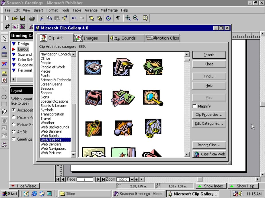
In today’s world of sleek, cloud-based design tools, it’s easy to forget a time when desktop publishing felt revolutionary. And for many of us, that revolution had a green and blue icon: Microsoft Publisher 97.
Ah, Publisher 97. The mere mention of it might conjure up memories of school projects, homemade flyers, or perhaps even a valiant, if somewhat blocky, attempt at a family newsletter. Released as part of the Microsoft Office 97 suite, Publisher 97 was, for many, their first foray into creating visually appealing documents beyond the confines of a word processor.
So, what made Publisher 97 so memorable?
For starters, it democratized design. Before Publisher, creating professional-looking layouts often required specialized (and expensive) software like QuarkXPress or PageMaker, and a steep learning curve to go with them. Publisher 97, on the other hand, was built with the everyday user in mind.
- Templates Galore: This was arguably its biggest selling point. Need a brochure? A business card? A greeting card? Publisher 97 came packed with a dizzying array of templates that you could simply fill in with your own text and images. This instant gratification was a revelation for non-designers.
- Wizards to the Rescue: Feeling overwhelmed? Publisher’s friendly wizards guided you step-by-step through the creation process, from choosing a layout to adding your content. It felt less like designing and more like answering a series of helpful questions.
- Clippy’s (Occasional) Absence: While Clippy, the infamous Office Assistant, was a staple of Office 97, Publisher often felt a little less intrusive with its helpful hints. Or maybe we just learned to ignore him better when we were in a creative flow!
- The “Build It Yourself” Appeal: Despite the templates and wizards, there was still a satisfying sense of accomplishment in dragging and dropping text boxes, images, and shapes onto the page. You could experiment with fonts (remember Impact and Comic Sans?), colors, and borders, making each creation uniquely yours.
Of course, it wasn’t perfect.
Looking back, Publisher 97 had its quirks. Layouts could sometimes be a bit rigid, and achieving truly precise control over elements could be a struggle. Images, once imported, sometimes had a mind of their own, and printing could be an adventure in itself, often requiring multiple attempts to get the margins just right. And let’s not forget the sheer amount of disk space it consumed – a significant chunk in those days!
Why does it still hold a special place in our hearts?
Publisher 97 wasn’t about pushing the boundaries of graphic design. It was about accessibility and empowerment. It allowed individuals and small businesses to create their own marketing materials, invitations, and reports without needing to hire a professional designer. It fostered a sense of creativity and gave people the tools to express themselves visually.
In an era where design software can feel overwhelmingly complex, there’s a certain nostalgia for the straightforward simplicity of Publisher 97. It was a gateway drug to design for many, laying the groundwork for more advanced skills and a greater appreciation for visual communication.
So, the next time you effortlessly whip up a beautifully designed document, take a moment to remember its ancestors. Remember the green and blue icon, the helpful wizards, and the simple joy of creating something new with Microsoft Publisher 97. It might be long gone, but its legacy of making design accessible lives on.
What are your memories of Publisher 97? Share them in the comments below!


